Using Multiple Digital Tools to Enhance Dark Photos


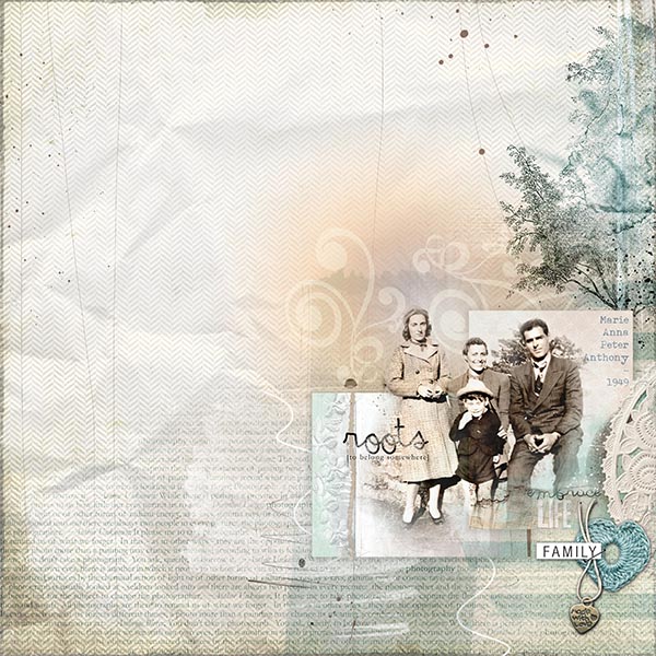
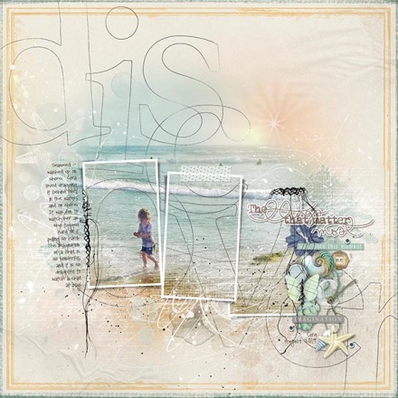
One of the great things about digital scrapbooking is that you have the ability to change the look of your photos using a combination of Photoshop tools and digital elements. For this layout, I began with a photograph that was not quite a silhouette, but close to it. I knew that I could use the Photoshop command curves (or maybe levels) to modify the image, but I find that it often works better if I play around with curves, the shadows/highlight command, blend modes and clipping masks and/or fotoglows as well. In this layout, I used a little of all of these, playing around with the effects until I was happy with the result.  I felt that the original photo was too dark to really tell the story, so I set out to change the image to make it easier to see the various details within the photo.
Begin with a template.  This one is Anna’s Artsy Layered Template no. 152.

Artsy Layered Template No 152

1.  Prepare your photo.  Turn off all of the layers on the template except for the 3 frames and frame shadows. Add a vector mask to each shadow, and  removed the shadow portion on the inside of each frame (as the photo clipping masks will not be used, due to the photo extending beyond the frames). Insert a background paper of your choice in a soft neutral color.  Keep in mind that using many of the blend modes will cause the photo to mix with the background paper colors, so choose your paper color accordingly.  Insert, and position the photo under the frames.

JSchaefer_Seaweed - Discover_1a

Place the photo on blend mode ‘Color Burn’.  It will wash out the photo, blending with the color from the background paper to give it a soft neutral, golden cast.

JSchaefer_Seaweed - Discover_2e

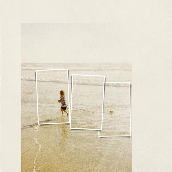
Apply a vector mask to the photo holding down the ‘ALT’ key and clicking on the vector mask.  This will cause the photo to disappear.  Then, making sure the ‘layer mask thumbnail’ in clicked in the layer stack, paint back in the portion of the photo you wish to show, using a soft white brush, at an opacity of about 15%, slowly building up the image. Duplicate the photo, and place the photo highest on the layer stack back on the ‘Normal’ blend mode. This, of course will show the original (dark) photo. Use the shadow/highlight command on this photo, to show more detail from the shadowed areas of the photo, and then use curves, to lighten the photo.  Now begin gradually painting out areas of the photo using a soft black brush to allow more of the photo layer below to show through.

JSchaefer_Seaweed - Discover_3e

2.  Begin adding glows.  Add the various fotoglows, to deepen the color of the water, to enhance the beach and to create a sunset. Add a vector mask to the glows and paint out (erase) the area of color in the white of the waves, and the little girl, so that the color stays looking natural.

JSchaefer_Seaweed - Discover_4e

3.  Use Template layers.  Begin turning template layers back on, manipulating their color and blend modes.  Add various other brushwork and transfers from other kits if desired.

JSchaefer_Seaweed - Discover_5e

4.  Embellish.  Add elements along the edge of the frame.  Add the UrbanStitchez.

JSchaefer_Seaweed - Discover_6e

5. Finishing Touches.  Add the DISCOVER BigWord.  I was lucky that the O encircled the little girl, otherwise I probably would have shifted the photo a bit. It could have been consider finished at this point, but often times a pages which have a great deal of brushwork and texture can benefit by adding an edge overlay to frame the page. Two were added here, one in a deep aqua, and another in a golden yellow.

JSchaefer_Seaweed - Discover_final-e

Click on image for layout supplies

So, before you decide to bypass that “too dark” photo, which holds a special memory you wish you could scrap, try some of these techniques.  You may be pleasantly surprised to find that that special memory can be scrapped afterall.  Be sure to experiment with other blend modes as well.

Need a helping hand for some of these blending techniques, see AnnaBlendz 1, 2 and 3


OPTIMIZING FLAWED PHOTOGRAPHS

I cherish each and every old family photograph I have. When I sit down to scrap one of these heritage photos, I hope to find the best way to showcase it, and really make it shine. Many of these old photographs are faded and discolored, and often have other flaws that make them a challenge. This original photograph was dull and had a huge shadow of the photographer in the bottom portion of it, so I knew I would want to blend the photograph on the layout to minimize this flaw, and use blend modes to maximize the details within.

Original scanned photograph

Original scanned photograph

To begin, I layer four background papers, playing around with different blend modes and opacities of each, until I achieve the soft, lightly patterned base.  To this I add two ArtsyKards in their PSD format, overlapping them, and adding a shadow to the base layer of each.

Ready to add the photograph

Ready to add the photograph

Although I edited the original photo prior to placing it in the layout, quite a bit of additional editing is done after importing it into the layout. In bringing in the photograph I first have to decide where I want it to be placed on the page.  I reduce the photos opacity, allowing me to see where the different design elements of the ArtsyKards are, which will enter into my photo placement decision. Keeping in mind that the ArtsyKards are in PSD format, and that the different layers of the Kards can be manipulated, I position and scale the photo. Now, duplicating this layer, and I bring this new layers opacity up to 100%.  I prefer painting the image in, rather than removing the parts I don’t want, so with the new 100% opacity photo layer highlighted in the layer stack, I hold down the ALT, and click the ADD VECTOR MASK button, located at the bottom of the layer stack.  This masks out the entire photo.  Then clicking the LAYER MASK THUMBNAIL,  of this layer, (making the mask active),  I begin to paint the photo back in, using a soft white paint brush.  If a mistake is made, I change the brush color to black, and paint out the mistake.   I usually start with a brush opacity of about 60%, but vary it as need be while painting in the photo.  By keeping the original, reduced opacity photo there as a guide, it makes it easier to paint the photo in.  For areas like the little boy’s suit, the opacity will be lower, however, for the face areas, I have the opacity at 100%, to best show the detail.  I purposely keep most of the area of the photo with the shadow, blended out, showing just a hint of this area.

Blending 1_600

Beginning the painting process

I now look at ArtsyKards to decide if there are any portions that I want to either turn off, move or even modify by changing their colors and/or blend modes.  For the Kard on the left,  I opted to change the dark vertical line to a soft brown,  plus I moved it, along with the bit of blended floral lace to the left edge of the kard.   Because of the dark shadow of the photographer being masked out, I took the words “embrace LIFE” on the right ArtsyKard, and moved them to that area, almost like I chose to mask out that portion of the photo to make the WordArt visible.   I can now delete the reduced opacity photo layer that was used as a guide.

Editing portions of the ArtsyKards

Editing portions of the ArtsyKards

The photo is still not quite finished.  I want to brighten it up a bit.  I apply the blend mode of DARKEN to the photo. This allowed some of the color and textures and WordArt from the Kards and the background paper to show through.  I duplicate this photo layer, and making certain that the top photo layer is my active layer, change the blend mode  to LINEAR LIGHT.  This brightens the image too much, so I bring the opacity of this layer down to about 40%.  You can see that it really brightened up the photo.

Keep in mind, with the two photos layers, it is fun to play around with the different areas, painting some areas in on one layer, and painting it out of the other.  In addition, experimenting with the various blend modes will give you different results, so with those photos, that you feel are just to dull and flawed, experiment with these techniques to figure out how to best emphasize what you want to emphasize within your photo, and you may surprise yourself with just how great the photo can be.   It is not uncommon for me to end up with 4 or 5 layers of one photo, each emphasizing a special area to create a better photo in the end.

I purposely allow some of the color and textures to show through, keeping much of the lower portion of the photo semi-transparent, but I keep the top portion the least transparent, so that the details of their faces shine through.  My last step to the photo is to check to be certain there are no textures showing through in areas that could distract from the photo, such as the chevron pattern showing through in their faces.  To eliminate that, I create a new blank layer, just under the two photo layers, and then with a light, neutral color, picked from the photograph, using a soft, reduced opacity brush, I paint on this layer to cover any of these unwanted patterns.  I don’t mind the chevron showing through much of the photo, but I like to keep the faces clean.  It is a personal preference for me.  In addition the area where the edge of the card and the card shadows left a visible line, I soften with a few brush strokes as well.

Second photo layer added, and blend modes applied

Second photo layer added, and blend modes applied

Now the layout is ready for additional design elements.

Family_1_600

I want to slightly darken the area around the ArtsyKards.  I add two FotoBlendz, changing their color, blend mode and opacity.  An additional ArtsyKard is inserted behind the two already placed.  I is enlarged to covered most of the lower right of the page. The background (base) layer of this ArtsyKard is turned off, and some of the remaining kard elements are moved around and manipulated by re-coloring, and/or blending.

Family_2a_600

A text page overlay is added, changing its color and blend mode, I mask out all but the bottom third of this overlay.  I add the Hipster Plumes in the area above the ArtsyKardz, changing their color, blend mode and opacity, so that there is just a hint of them showing.

Family_2_600

Elements and WordArt are added.  The versatility of the ArtsyKardz PSD files gave me the ability to take the doily element from the ArtsyKard, and enlarged it until it reaches the right edge of the paper.  Names and the date are added to the corner of the ArtsyKard on the right.

Family_3_600

The layout is basically done, but to add a bit more interest, I add the SkinnyLined Overlay, and the Tree brush, which mimics the tree in the photograph.  My final element is the FotoGlow, which is added directly under the Hipster Plumes, manipulating its color and opacity to best enhance the Plumes.

Family_4_600

For product credits, click on image.

If you have yet to play around with masking and blend modes, I do hope this tutorial gets you started.  It is so fun to play around with Photoshop, and amazing what it can do for a layout.

CLIMB – a multi-photo, template layout.

I recently took a trip with my daughter to visit my parents back east. While there, my daughter decided she had to climb one of the two huge pecan trees in the front yard. My immediate thought – PHOTO OP!!! It was rather comical, as my daughter found it much more difficult to get up in the tree as she had thought it would be. I loved the photos for a good many reasons: first off, it is always difficult to get any photos of my daughter, so I was pleased with the opportunity to get some spontaneous shots, and second, I loved the texture of the bark of this gigantic pecan tree. I held the photos for some time, just not knowing how to scrap them. I have to admit that I get use to scrapping one photo at a time, as I feel there is often times much more impact when you can concentrate on just one image. In this case, however, I felt a layout created using multiple photos, told the best story.

AASPN_FotoInspiredDoubleTemplate8

Templates always make the job of putting together a layout so much easier.  It must also be remembered that the versatility of a template is its ability to be modified.  The template I decided to use was rotated 90 degrees.  In addition, I swapped two of the masks, to better work with the photos.  I used FotoInspired DoubleTemplate No. 8 by Anna Aspnes.

Climb-deconstructed_1_600

I attached the photos to the photo masks of the layout, and placed two ArtsyKardz to be used for journaling, applying shadows to both.  I used the PSD files, slightly re-coloring layers to best work with the colors within the photographs.  The third ArtsyKard was attached to the center photo mask of the template.  I then added the journaling, I applied a neutral Weathered Neutral paper for the template background, added the epoxy brad, and word strips.  At this point I decided to reduce the scale of the entire layout, allowing me to add the green weathered neutral paper behind the template, and edged it with the lined overlay, changing its color.  I added the title “CLIMB!” using the NotebookAlpha.

Climb-deconstructed_2_600

I wanted to add a bit more impact to the layout, so.  I added the 12×12 fotoBlendz just on top of the template background paper, changing its color, blend mode and opacity.  I added some dripped stains on top of the 12×12 fotoBlendz, making them white, playing around with the blend modes and opacities as well.  I took a stitched LoopDaLoop and angled it so that two of the loops encircled my daughters face, and finished up adding a flutterby tattoo to the center ArtsyKard.

Click on the layout to go to Oscrap gallery for product credits.

Click on the layout to go to Oscrap gallery for product credits.

Heritage with a Twist

When you imagine a Heritage page scrapped, most people immediately think in terms of neutral beige, brown, off white, etc., along with loads of ephemera in layers throughout the page, sepia toned photos, and possibly torn and tattered elements.  Seldom does color come into play, unless it is that slight, unexpected splash that maybe leads your eye through the page.  I have to say that I love those pages as well, however, I also love to see something different thrown into the mix as well.

Every so often I have a photograph that is just so special that I want to make certain I do it justice when I scrap it, and this photograph is definitely one of those photos.  I used a great many kits to complete it, but the inspiration came from the new package released by Anna Aspnes this past week:  ArtPlay Palette Enroute, Enroute No. 1 (brushes), and Enroute Sampler.  The hues of dusty aqua, and grays were so inviting, that I immediately thought of this photo.  Here is the finished page:

School Girls

School Girls

I didn’t start out thinking the page would end up like this, but am so happy with the final result. I began with the background paper from the Palette, and placed upon it, the photograph in the torn frame. I began by blending the photograph within the frame, applying blend modes to see what looked best. I didn’t like the result, as the black and white blended image just didn’t look right.  I decided to try making the photo with a blue tint.  To do so, I first attached a textured blue solid to the fotomask, and then changed the blend mode of the photograph, attached to it, to luminosity.  This caused the photo to take on the hue of the paper. I blended from the photo, the children’s outlines, but I also wanted some of the background of the photo to show through as well, so I created a second photo layer, and again, using the luminosity blend mode, began blending in the entire photograph, just slightly, until I got enough of the background, thus giving a somewhat dreamy look.

using un-blended original photograph

using un-blended original photograph

I then begin dragging into the layout brushwork, transfers and elements that I believe would go well.  I added an edge overlay, changing it’s color to a pale yellow.  Under that I added two edge transfers, bringing in additional neutral colors to the right edge.  I began layering element to the bottom right corner of the photograph, plus a few fotomasks directly on top of the background paper, changings the color to a blue, and modifying the blend mode and opacity to deepen the color around the photo.

Added brushwork, transfers, elements and edgework

Added brushwork, transfers, elements and edgework

Once I am almost done with a layout, I typically look for what might be missing, or what items I could add to polish up a layout. I decided adding the brushwork of the tape measure numbers, the ScriptTease text along the right border, and the lace along the bottom edge of the photo would be perfect to finish it off. I can have the tendency to add too much, so I am often adding and removing items to find that right balance.

Finished Layout

Finished Layout

ANNIVERSARY CELEBRATION

It is hard to believe that it has already been one year since Anna Aspnes Designs came to Oscraps.  In thinking about this past year I began to realize how much I have grown as a digital scrapper.  When I first began using her digital scrapbook kits I didn’t know where to start, and I had concerns I would do it wrong.  Once I got past that fear, I realized there was no right way or wrong way as long as you were creating something that spoke to you.   Her kits have allowed me to think a bit outside the box, and freed up my style just a bit, and I can say that I really doubt I would have grown as much  if I was working with the more traditional digital scraping kits.

I have since become a member of Anna’s Creative Team, and feel so honored to be amoungst some very talented ladies.  They teach me a great deal and their talent pushes me to become better.

In honor of Anna’s one year anniversary, she is having a sale and some fun a games, so if you have yet to ever work with any of Anna’s kits, I invite you to come and check out her store, and of course to partake in some of the activities.  Be sure to check out Anna’s blog.

I sat down to pick out some of my favorite items of Anna’s and found that next to impossible.  Instead I could only narrow things down to a few product types like edge overlays, LoopDaLoops, and fotoblendz.  I was, however, able to pick out a kit – mainly because I always seem to have loads of beach photos.  The kit is ArtPlay Palette Salty Living.

Image

The page I created is of my daughter running on the beach at 4 years old.  In the background you can see The Hotel Del Coronado.  Although the photo was taken over 16 years ago, I remember the delight on my daughter’s face as she ran on the wet sand, and how she giggled when she ran too close to the water’s edge.  Not much is better than a child playing on the beach.

As I work on a layout, it seems to take on it’s own life and evolve into the final – finished version.  Although I never planned to have the more neutral colors at the bottom of the page, I felt it worked well with the beach sand, and I loved the little bits of red that is mimicked by the roof from the hotel and the red in my daughters dress.   I also love the reflections of everything on the wet sand.

BECOMING FRIENDS

When scrapping, I try to do challenges when I can, but since I frequent a good many digital sites, I am usually overwhelmed by the magnitude of possibilities each month. One challenge that I do try to do each month is the template challenge. I love templates, although I usually change them up so they are often times far removed from the original template, but it is great seeing what I come up with compared to all the other scrapper’s doing the challenge. This is February’s Template Challenge at http://www.the-lilypad.com.

February's Template

Here is my take on the template:

Becoming Friends

I knew as soon as I saw the template, I wanted to create a page, and after a bit of searching in my digital photos, I found the one I had wanted to scrap for a while, but just hadn’t. I also immediately knew the background paper, because again, I had seen the paper, and was holding out to use it on the right page. This also is a page where as a Creative Team member of Amy Wolff at the-Lilypad, I was wanting to use her newest product, a great set of kraft paper date cutouts:

Date Cutouts

I just really fell in love with this background paper: I am usually taking a page, and modifying the main paper, adding grunge, adding folds, inking the edges, etc., but this paper was perfection.

For this page, the original template had loads of layering. This is something I find I can struggle with, as I can spend hours staring at the page, and slightly tweaking the elements until things look perfect. For me it is the right amount of layering. I often feel that people add way too much in the way of layered and clustered items on their pages that it can often overwhelm the photograph. I want to make the photo shine, and to hopefully have the elements lead your eye to the photo. The photo I chose was of my daughter walking our horse Dusty on the day we took delivery of him. He was getting acquainted with his 3 new owners, and checking out his new surroundings. Such a mellow horse – even though not quite 5 years old in this photo, nothing bothered him – he is always interested it checking out new things – never afraid, but ready to reach down and sniff, or gum any new item he comes along. We chose him for this reason, and we think it was a great reason to buy him, as he has turned into being a great horse – I think mainly because of this trait.
I also feel that I tend to be quite the traditional scrapbooker – seldom doing the unexpected – by adding that one quirky element. I am trying to add those items when I can, so for this one, I worked in the zigzag stitching with the button. I think it works, and it adds a bit of interest.

In the end, it is quite a bit removed from the original template, but like I said, I seldom stick with the template without modification. I am so happy with how it came out. I love the softness of the colors, especially the muted taupe colors on the background paper, and how I carried the color throughout the page.

LOVE IS IN THE AIR

Well we all know that Valentines Day is coming up.  As a scrapper, it is about this time that we are flooded with wonderful Valentine themed kits.  I am highlighting one of the kits just out.  It is a collaboration by Erica Zwart Designz and Anita Designs at Mscraps called Stuck On You.  The papers are wonderful, full of pinks of different hues, a wonderful variety of cardstock, a soft mix of patterned papers, and a great variety of elements.

Image 

 I had been wanting a kit with soft muted colors for a favorite photo of my daughter when she was a toddler.  This kit looked perfect.  I will love you forever
Some of the techniques I used on this kit were custom shadows all of the elements that had height, so the rolled flowers each had a custom shadow as did the ribbon.  I took the paper which was made of rows of hearts in all different colors:

Image

I cropped out a few rows, the length of the paper, thinking I would use it as a horizontal element under the lower portion of the photo grouping. I didn’t think it looked right, so I then decided to extract only the row of deep pink hearts, and use them. I used the magic wand tool, selected the pink hearts, I wanted to keep, then did an inverse selection, and hit the delete key. This allowed me to get rid of everything but the pink hearts.

The kit included a column of repeated text which was just of XOXOXOX, of varying lengths. I placed in on both sides of the top background paper, but blended it into the paper, and then used a mask to use it to add an almost grunge feel to the paper. I wanted more grunge, so I used two of Erica’s grunge border overlays, and recolored one to a deeper pink, the other I place just to the inside of the first and made that one white, to provide the look of another frame – each overlay has a blend mode used on it so that it looks like it is part of the paper, and not on top of the paper. I placed the repeated LOVE word art under my photo/element block. Although it was not long enough to go from top to bottom, I placed one at the top, copied it and dragged it to the bottom. I used the blend mode “linear burn” on it so that the texture of the paper would show through. I liked having a vertical element in contrast to the horizontal hearts. I place a swirling scribble underneath the photo, and at the tail end placed both a photo glow, and a flower from the it. Around the large loop of the swirl, I placed a quote which reads: I’ll love you forever, I’ll like you for all days. As long as I’m Living, My baby you’ll be.

I love how it turned out. It was an old film photo I had been wanting to scrap for years. Any comments would be appreciated – especially any positive constructive criticism of things you would have done differently, and why. It is the best way to grow. Thanks for stopping by.

Finally Home

Last year I made the decision to push myself in the areas of photography and digital scrapbooking. That decision caused me to venture outside my scrapping world, and checking out the multitude of wonderful site out there with some really fabulous designers. There is certainly not a shortage of wonderful designers out there, and my stash has increased quite a bit. I have also ventured out into the world of being on designer creative teams (CT). I applied and was accepted to become part of two teams. I will try to showcase new products when I can for both of these designers, as well as an occasional product I may run across from time to time that I think are especially awesome. Like I said – there is no shortage of great designers out there, and boy, does it make scrapping so much more enjoyable.

I became a member of Amy Wolff’s CT back in mid-November 2011. Her products range from very traditional to funky, so it gives me the ability to go in any direction with my pages. These two kits were released on January 13:

11:00 am Paper Pack

11:00 am Element Pack

I went back and pulled from my old photos, one that was 20 years old – from when we bought our home. We were so excited about our first home that we asked our realtor to take our photo by the sold sign. Amy’s kit worked perfectly with the photo. I loved greens in the kit as well as the complimentary colors in the kit, but it was the fence from the element pack that immediately led me to the sold sign photo. The only thing I needed other than these two kits was an alpha.

Finally Home

BLEND MODES

I am one of the photoshop users that has learned what they know by playing around with the program. That being said, I have been learning that the look of an item can be dramatically altered. The image below is one I recently did where I received multiple comments asking how the look was achieved. I will briefly touch on a few areas to give you a starting point in which you can try this on your own.

Old Poway Park

I began with the photo. I also had some new supplies that I figured I would probably use by Anna Aspnes of oscraps. Her new kit ArtPlay Palette Autumn Haze gave me the inspiration as it had some great earthy tones, along with graphics of leaves that I thought would work well. I knew I wanted to place this photo on a clipping mask, but knew little more than that. I began my page with a simple background paper, place the clipping mask, and then the photo. I began with a neutral color, just knowing I wanted the linen texture and the slight wrinkles to show, but I usually start neutral, and then either change this neutral paper to work well with a color in the photo, or pull in another paper I find as I am working that I think works well.
Fig. 1I played around with colors for a bit to try to zero in on what background color I should use, and ended up with an olive greenish color. This was obtained by adding a dark olive-green on top of the beige, and changing the opacity of that until I was pleased. I then pulled some elements from Anna’s Autumn Haze kit, and her Sampler No. 1 kit and tucked them under the clipping mask. Thinking that I would like to somehow frame the photo I decided I would take one of Anna’s edge overlays, and scale it such that they framed the photo. I added another edge overlay to the outer most edge of the page. I knew I wanted the inner frame to be dark, but I decided to make the outer overlay a lighter color to start.
Fig. 2Things were coming along, but I felt it needed more grunge throughout the entire page as well as more along the edge. I next added another paper on top of everything. The paper was from Anna’s Sampler No 2. I could see in this paper that it had some slight grunge properties to it, but I make this grunge more extreme by using curves in Photoshop. At this point I started playing around with blend modes. Although my intent was not to have this paper affect the photo itself, I mistakenly placed it above the photo, and after I decided the blend mode “multiply” gave it a very grungy look. I put this sheet at 56% opacity as well. Under this layer I added a few more overlays to both the outer edge and 2 more to the photo itself, as I felt the single frame was not enough. I added quite a few little brushes around the outside as well as some text brushes. Some of these brushes were changed by using blend modes, others by just changing the opacity, and still others were modified by using the hue/saturation of the element. The images below show the page with the paper blended above all the page elements, and the second image is what it looks like with the blended paper hidden. You can see how it dramatically changes the feel of the page. I actually like both versions, but I liked the feel of the page with the added grunge, as it just seemed to give the page a magical feel to it.


I played around with all the brushes I added to the corners and edges, and found that some looked better above or below others. The colors of these brushes were modified so that the final color of the brush was one pulled from the photo.

I decided I would add a line of brown stitching to reinforce the frames made by the overlays. I like to title and date all pages, so after playing around with different font possibilities, I ended up using VNI-Thufap1 for both the title and date in the lower left. I am a big lover of the look of repeated elements, and chose pearls from Anna’s ArtPlay Palette Barren Sunrise, added a custom shadow, and made sure they were placed above the grunged blended paper overlay. I also pulled a butterfly epoxy element from Anna’s Find My Way Brads, and placed that with the cluster of leaves in the lower right of the photo. This element I chose to be under the grunged paper, causing the element to look more aged than it was. I also added one of Anna’s dotted loopdaloop, as I love to sneak them into my pages. I tweaked all elements if necessary by either decreasing saturation, or opacity, or blend mode until I felt everything worked together. Prior to publishing, I duplicated the grunged paper overlay, changed it’s opacity to about 20%, thus adding a bit extra grunge to the entire page, but decided to eliminate that grunge from the sky in the photo. I did this by added a layer mask, and painting out the grunge from the sky area. I did not include in my description all items used, so if you need to, the top image is linked to my gallery.

If you have never worked with blend modes, changing the opacity of an element, or changing hues and saturation of elements, you might want to play around with them are they are very versatile and can dramatically change the look of a layout.

HOMETOWN HERO

I cannot even imagine entering the military, and heading off to war. Those that do, I feel a great deal of gratitude toward. They freely fight the enemy knowing they may not come back after the war. Too many are killed, or injured. I feel for all who choose to fight the terrorists that wish to do us harm.

In my hometown, my daughter tells me about all of her friends that chose to enter the military after they graduated high school. She is able to keep in touch with them from their occasional posts on Facebook. We are both always concerned for their safety, hoping they all come back safe once their tour is done.

This past December, my daughter learned that one of her friends was killed in action. It was so hard to console her as it is hard for a young adult to have to face death, and she as seen her share of it through high school, and now the war or terror. I spent much of the next few days looking online at the information about this young man’s death, as well as the other’s that had died with him. I found photos and videos of Kenny, and it was heart-breaking to think of how his family was coping.

Kenny Necochea


My being a digital scrapper, I immediately archived a number of photos of Kenny, and asked my daughter if she would like a page done in his memory. Through her tears, she said she would like that very much. He died on December 12, 2010, and over the months I attempted to scrap his page, but I never felt that any of the pages I started did this young man justice. This page had to be special. When the 10th anniversary of 911 was upon us, I again thought of Kenny. Although this page was not completed for this 10th anniversary, I began working on it again, and finally felt satisfied that it was a fine enough tribute for Kenny. When posting this page, I got many a comment from others saying that this scrapbook page of Kenny helped remind them of all the wonderfully courageous military men and woman out there fighting to protect us. Kenny proudly served in the Army in the 101st Airborne, he is any of thousands of men and women that have been killed or injured. We need to be reminded sometimes that although our lives continue as it always has, there are others out there laying their lives on the line to keep us safe. I will always have Kenny Necochea in my heart. He has shown me how important it is to be thankful for the special life we have, and to not take things for granted. I will always remember that you gave your life to keep us safe. God bless you Kenny, you will always be in my heart.